Getting started
Using the controls in XPages is a simple process
XControls is built on top of Bootstrap 3 and the Bootcards project. It enables XPage developers to create controls that are responsive, optimizing to the device whether it be a smartphone, a tablet or a PC. XControls was designed with three key goals in mind:
- Enable faster design and assembly of modern user interfaces, using Card & List objects (analagous to Forms and Views in traditional Notes development)
- Make it easy to write an XPages app which auto-optimizes to smartphones, tablets and PCs.
- Make it easy to create XPages apps which work offline on mobile devices (via the Teamstudio Unplugged XPages engine for iOS and Android)
As XPages developers we can think of two main types of controls: cards and lists. Cards are the equivalent of forms, so they display the data from a single document, whereas lists are analagous to views, they display list of summary data.
When you're creating an application you'll need a header and footer custom control to make your life easiest. They will define the structure of your application.
The header will include resources, navigation etc. The footer will include the footer bar and any custom JS files you want to download.
<?xml version="1.0" encoding="UTF-8"?>
<xp:view xmlns:xp="http://www.ibm.com/xsp/core" xmlns:unp="http://unplugged.teamstudio.com"
	disableTheme="true">

	<unp:UnpBootResources>
	</unp:UnpBootResources>

	<unp:UnpBootHeader title="Sampler">
		<unp:this.navitems><![CDATA[#{javascript:[
        ... Header Menu for Desktop goes here...
]}]]></unp:this.navitems>
	</unp:UnpBootHeader>

</xp:view>
Then in between the header and footer you can insert one or more cards to create your application. The rest of this page shows the different options. If you need some help to get going then have a look at how we built the Sampler application for inspiration.
To install the Sampler application onto your devices, copy and sign the XControls Sampler nsf file onto your Domino server. You can then access it using a desktop or mobile browser. If you want to test Teamstudio Unplugged, then you'll need to add the Unplugged.nsf admin database to your server, add the Sampler application as an app inside the configuration and then sync Unplugged on your mobile device to your server. For more details on this process, you can visit the Teamstudio Unplugged Documentation.
For a more detailed walk-through of creating an application, you can visit our detailed getting started page.
Deployment
This section details a few bits and pieces that will make your application easier to deploy.
As of version 1.2 of XControls, we support the built in the use of "runtime optimized JavaScript and CSS resources". If you enable this in the XPages Properties Editor on the Persistence tab, then pages will be significantly smaller. It is not required, however, to enable the setting. Often when doing development it is easier to leave it disabled.
When creating an application, if it is going to be used on Teamstudio Unplugged mobile devices then we recommend that the home XPage is called UnpMain.
Font Awesome Icons
We support Font Awesome Icons everywhere
To add icons to your application you can use the very simple Font Awesome css classes in your code.
<i class="fa fa-camera-retro"></i>
Lists
Accordion List
The Bootcards equivalent of a categorized view


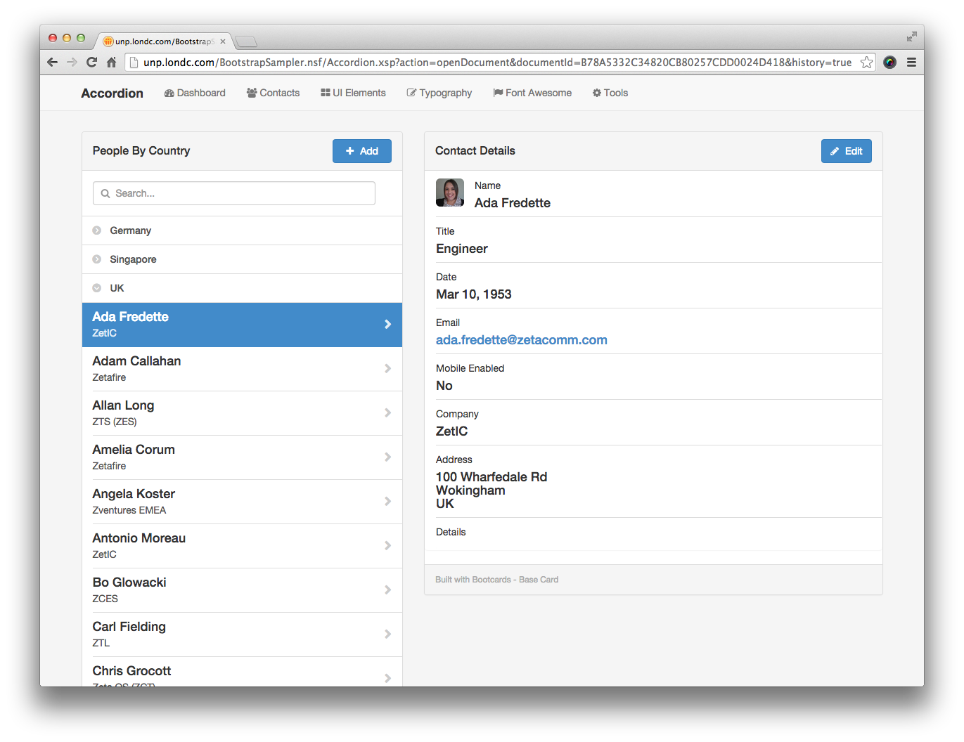
You can specify the categorized view you want to acces, the columns that will get displayed and what happens when you open a document. We also support searching and composing new documents.
- searchview
- the name of the view to search, leave blank to disable searching. The search view should be categorized with all the values to be searched in a typeahead style search. Look at the sampler application for an example of how to set this up.
- newlink
- the link to open when composing a new document
- newdatatarget
- the div to insert the new document into. Default is #editModal
- dbname
- The database name to get data from, leave blank for current database.
From 1.4 To use a database on a different server use the format: myserver!!mydir/mydb.nsf (application server must be in trusted servers list on remote server, application server must be explicitly in ACL for remote database, and application server must be able to resolve remote server host name) - viewname
- The view name to get data from
- summarycolumn
- The title of the column to display summary data from
- detailcolumn
- The title of the column to display detail data from
- photocolumn
- The title of the column to get the URL for a thumbnail from. Leave blank if not required.
- xpagedoc
- The XPage to open when viewing a document. Default would be the current XPage name
- xpagedocdbname
- The database that contains the XPage to load, leave blank for current database
- title
- The title for the Accordion view. From v1.6, this text can be HTML.
- categoryfilter
- To apply a filter to the view before getting data, enter the filter value here. This allows for two levels of categorization
- categoryindex
- The column of the view that contains the cateogirized column
- ajaxload
- Whether to load data using Ajax. Default is Yes, can be set to No
- loaddocumenttarget
- The name of the div to insert the loaded document into. Default would be doccontent
- searchlocal
- If set to yes and searchview is blank then a local search will be provided.
- expandfirstcategory
- Set to yes or no. yes will auto expand the first category when viewing the accordion
- footertext
- A string to display in the footer of the list. Leave blank if not required.
- callback
- from v1.3 the name of a client side JavaScript function to call after opening a document
- openineditmode
- from v1.5 set to true to open a document in edit mode rather than read mode, default = false
If you're using this control, don't forget that you will also need to include the UnpAccordionViewList XPage.
<?xml version="1.0" encoding="UTF-8"?>
<xp:view xmlns:xp="http://www.ibm.com/xsp/core" xmlns:xc="http://www.ibm.com/xsp/custom"
  xmlns:unp="http://unplugged.teamstudio.com">

  <xc:commonheader></xc:commonheader>
  <div id="main" class="container">
    <div class="row fullheightrow">
      <unp:UnpBootAccordionView title="People By Country"
        summarycolumn="FullName" viewname="People By Country"
        expandfirstcategory="no" ajaxload="Yes"
        loaddocumenttarget="doccontent" detailcolumn="Company"
        xpagedoc="Accordion.xsp" newdatatarget="#editModal"
        newlink="PersonEdit.xsp" searchview="Search" photocolumn="Photo"
        footertext="Built with Bootcards - List">
      </unp:UnpBootAccordionView>
      <div id="doccontent" class="col-sm-7 bootcards-cards hidden-xs" style="display: none;">
        <xc:personviewer>
          <xp:this.rendered><![CDATA[#{javascript:context.getUrlParameter("documentId") != ""}]]></xp:this.rendered>
        </xc:personviewer>
      </div>
    </div>
    <div class="pagetitle hidden">Accordion</div>
  </div>
  <xc:commonfooter></xc:commonfooter>
</xp:view>
Categorised List
Using the Flat List you can also displayed categorised data.
Simply specify the "categoryindex" property when you specify the control in your XPage.
Detailed List
Very similar to the Flat List, but displays more columns of data. Available from v1.2 onwards.
Optionally add icons and other formatting.
- searchview
- the name of the view to search, leave blank to disable searching. The search view should be categorized with all the values to be searched in a typeahead style search. Look at the sampler application for an example of how to set this up.
- newlink
- The link to open when composing a new document, leave blank to hide new button
- dbname
- The database to load data from, leave blank if not required
From 1.4 To use a database on a different server use the format: myserver!!mydir/mydb.nsf (application server must be in trusted servers list on remote server, application server must be explicitly in ACL for remote database, and application server must be able to resolve remote server host name) - viewname
- The view to load data from
- summarycolumn
- The column title to load summary data from
- detailcolumn1
- The column title to load detail data from
- detailcolumn2
- The column title to load detail data from
- detailcolumn3
- The column title to load detail data from
- photocolumn
- The column title to load photos from, leave blank if not required
- xpagedoc
- The xpage to load documents with, by default this would be the same as the current XPage
- xpagedocdbname
- The database that holds the xpage to load documents from, leave blank if not required
- title
- The title for the list. From v1.6, this text can be HTML.
- categoryfilter
- A filter to apply to the view before loading data
- numberofrows
- The number of rows to display per page. Default is 20
- enableazpicker
- yes or no, enable the A-Z picker. If yes then it is best to load all documents in the view by setting number of rows to a large number
- categoryindex
- If you want to display categories, they will be non clickable but can effectively break up lists of data. This is the index number for the category column to use (counting from 0). Leave blank if not required.
- ajaxload
- Optionally load documents using a full page load, default is to use Ajax for performance reasons
- searchlocal
- If set to yes and searchview is blank then searching on the currently displayed list will be enabled
- footertext
- A footer text message to display. Leave blank if not required.
- callback
- from v1.3 the name of a client side JavaScript function to call after opening a document
- openfirstdocument
- from v1.3 set to yes by default, if set to no then document will not be opened automatically when opening the view
- openineditmode
- from v1.5 set to true to open a document in edit mode rather than read mode, default = false
<?xml version="1.0" encoding="UTF-8"?>
<xp:view xmlns:xp="http://www.ibm.com/xsp/core" xmlns:xc="http://www.ibm.com/xsp/custom"
  xmlns:unp="http://unplugged.teamstudio.com">

  <xc:commonheader pagetitle="Detailed View"></xc:commonheader>

  <div id="main" class="container">
    <div class="row fullheightrow">
      <unp:UnpBootDetailedView title="People" summarycolumn="FullName"
        viewname="People By Last Name" numberofrows="20" ajaxload="Yes"
        detailcolumn1="Company" detailcolumn2="Country" detailcolumn3="City" xpagedoc="DetailedView.xsp"
        newlink="PersonEdit.xsp" searchview="Search" photocolumn="Photo" footertext="Built with Bootcards - List">
      </unp:UnpBootDetailedView>
      <div id="doccontent" class="col-sm-7 bootcards-cards hidden-xs">
        <xc:personviewer></xc:personviewer>
      </div>
    </div>
    <div class="pagetitle hidden">Detailed View</div>
  </div>

  <xc:commonfooter></xc:commonfooter>
</xp:view>
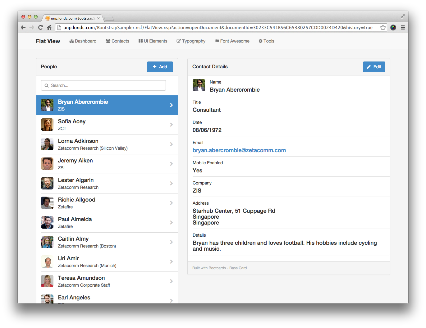
Flat List
Display a view of data as a list.
Optionally add icons and other formatting.


- searchview
- the name of the view to search, leave blank to disable searching. The search view should be categorized with all the values to be searched in a typeahead style search. Look at the sampler application for an example of how to set this up.
- newlink
- The link to open when composing a new document, leave blank to hide new button
- dbname
- The database to load data from, leave blank if not required
From 1.4 To use a database on a different server use the format: myserver!!mydir/mydb.nsf (application server must be in trusted servers list on remote server, application server must be explicitly in ACL for remote database, and application server must be able to resolve remote server host name) - viewname
- The view to load data from
- summarycolumn
- The column title to load summary data from
- detailcolumn
- The column title to load detail data from
- photocolumn
- The column title to load photos from, leave blank if not required
- xpagedoc
- The xpage to load documents with, by default this would be the same as the current XPage
- xpagedocdbname
- The database that holds the xpage to load documents from, leave blank if not required
- title
- The title for the list
- categoryfilter
- A filter to apply to the view before loading data
- numberofrows
- The number of rows to display per page. Default is 20
- enableazpicker
- yes or no, enable the A-Z picker. If yes then it is best to load all documents in the view by setting number of rows to a large number
- categoryindex
- If you want to display categories, they will be non clickable but can effectively break up lists of data. This is the index number for the category column to use (counting from 0). Leave blank if not required.
- ajaxload
- Optionally load documents using a full page load, default is to use Ajax for performance reasons
- searchlocal
- If set to yes and searchview is blank then searching on the currently displayed list will be enabled
- footertext
- A footer text message to display. Leave blank if not required.
- callback
- from v1.3 the name of a client side JavaScript function to call after opening a document
- openfirstdocument
- from v1.3 set to yes by default, if set to no then document will not be opened automatically when opening the view
- openineditmode
- from v1.5 set to true to open a document in edit mode rather than read mode, default = false
- searchfulltext
- from v1.6 boolean switch to enable full text searching in the specified view rather than using view entry searching which is still the default. If you want to use FT searching, be aware that it will not work on Unplugged devices and for Domino servers, the database must be Full Text Indexed!
We do have one known issue with the A-Z Picker when using it in iOS and Unplugged (not Safari), there are situations where the list will disappear until the user touches their screen again. We're still investigating a solution to this issue.
<?xml version="1.0" encoding="UTF-8"?>
<xp:view xmlns:xp="http://www.ibm.com/xsp/core" xmlns:xc="http://www.ibm.com/xsp/custom"
  xmlns:unp="http://unplugged.teamstudio.com">

  <xc:commonheader pagetitle="Flat View"></xc:commonheader>

  <div id="main" class="container">
    <div class="row fullheightrow">
      <unp:UnpBootFlatView title="People" summarycolumn="FullName"
        viewname="People By Last Name" numberofrows="20" ajaxload="Yes"
        detailcolumn="Company" xpagedoc="FlatView.xsp"
        newlink="PersonEdit.xsp" searchview="Search" photocolumn="Photo" footertext="Built with Bootcards - List">
      </unp:UnpBootFlatView>
      <div id="doccontent" class="col-sm-7 bootcards-cards hidden-xs">
        <xc:personviewer></xc:personviewer>
      </div>
    </div>
    <div class="pagetitle hidden">Flat View</div>
  </div>

  <xc:commonfooter></xc:commonfooter>
</xp:view>
Forms
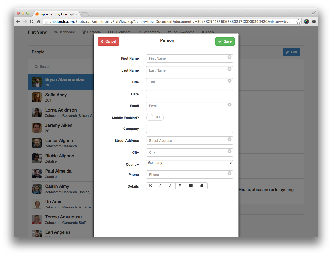
Form Editor
A wrapper into which you can insert form fields for creating and editing documents
Form fields can include auto clearing, type ahead, date pickers, numbers, rich text and more!


- dbname
- The name of the database that contains the document, leave blank for current database
From 1.4 To use a database on a different server use the format: myserver!!mydir/mydb.nsf (application server must be in trusted servers list on remote server, application server must be explicitly in ACL for remote database, and application server must be able to resolve remote server host name) - formname
- The form name of the document being edited
- title
- The title for the form card
- showbuttons
- yes or no to show or hide the save and cancel buttons
- viewxpagename
- The name of the XPage to open after saving the document, would normally be the same as the current XPage
- callback
- from v1.3 the name of a client side JavaScript function to call after successfully saving a document
- fullpagemode
- from v1.4 a boolean switch to allow you to run the editor control in a full page rather than a dialog. Cancel button takes user back to previous page. When using this, make sure that your "doccontent" div has the class "full-width" assigned to it.
- presavecallback
- from v1.4 the name of a client side JavaScript function to call before running standard form validations. It must return true or false. If false the save will not proceed.
The fields supported require various extra settings. In the example below you can see:
- To make a field required add a class of "required"
- To add a clear cross inside a field, add the bootcards-clearinput markup after the field
- To make a field into a date picker use the example of the initialcontactdate field, add the datevalue attribute
- To make a field into a date/time picker, use the example of the initialcontactdatefield, but add the datetimevalue attribute instead
- To enable a mobile toggle use the markup of the mobileenabled field
- To provide a typeahead list, add the jslist attribute to the field, the value of this attribute is the name of a JavaScript array that will be used to search for the typeahead list
- from 1.5.2 Alternatively, if your typeahead is looking up a large list (more than 1000 items) you can add the attribute "searchahead" set to a URL like this:
<xp:inputText id="JobNumField" value="#{docedit.Job}"

    styleClass="required form-control typeahead JobNum" autocomplete="off">

  <xp:this.attrs>

    <xp:attr name="searchahead" value="UnpSearchAhead.xsp?chosenView=UnpJobSearch"></xp:attr>

  </xp:this.attrs>

</xp:inputText> - Combo boxes can be used as normal
As with previous versions of the Unplugged Controls, the field id is used to identify the field name to save data to.
You can prefix the field id with various settings to influence the data type:
- __ (two underscores) will make the field multivalue, use commas as a separator
- int_ will make the field an integer (ie a number)
- float_ will make the field a number with decimal points
- All other fields will be assumed to be strings
Date pickers will de different depending upon the client. On mobile devices and in the Chrome browser on the desktop, the native date picker will be used. In IE and Firefox on the desktop, a bootstrap date picker will be used.
          <?xml version="1.0" encoding="UTF-8"?>
          <xp:view xmlns:xp="http://www.ibm.com/xsp/core" xmlns:xc="http://www.ibm.com/xsp/custom"
          xmlns:unp="http://unplugged.teamstudio.com">
          <unp:UnpBootFormEditor showbuttons="yes"
          viewxpagename="FlatView.xsp" formname="Person" title="Person"
          xp:key="facet_1">
          <xp:this.facets>
          <xp:panel id="list-group" xp:key="facet_1">
          <div class="form-group">
          <xp:label styleClass="col-xs-4 control-label" for="name"
            value="First Name"></xp:label>
          <div class="col-xs-8">
            <xp:inputText id="firstname" value="#{docedit.firstname}"
              styleClass="form-control required">
              <xp:this.attrs>
                <xp:attr name="placeholder" value="First Name"></xp:attr>
              </xp:this.attrs>
            </xp:inputText>
            <a href="" class="bootcards-clearinput">
              <i class="fa fa-lg fa-times-circle"></i>
            </a>
          </div>
          </div>
          <div class="form-group">
          <xp:label value="Date" id="initialcontactdatelabel" for="initialcontactdate"
            styleClass="col-xs-4 control-label">
          </xp:label>
          <div class="col-xs-8">
            <xp:inputText id="initialcontactdate" styleClass="form-control">
              <xp:this.attrs>
                <xp:attr name="datevalue">
                  <xp:this.value><![CDATA[#{javascript:try{
          var date:lotus.domino.local.DateTime = docedit.getItemValueDateTime('initialcontactdate');
          return date.toJavaDate().getTime();
          }catch(e){
          return new Date().getTime();
          }}]]></xp:this.value>
                </xp:attr>
              </xp:this.attrs>
            </xp:inputText>

          </div>
          </div>
          <div class="form-group">
          <xp:label value="Mobile Enabled?" id="mobilelabel" for="mobileenabled"
            styleClass="col-xs-4 control-label">
          </xp:label>
          <div class="col-xs-8">
            <xp:panel id="toggle">
              <xp:this.styleClass><![CDATA[#{javascript:var out = "bootcards-toggle";
          if (docedit.getItemValueString('mobileenabled') == "on"){
          out += " active";
          }
          return out;}]]></xp:this.styleClass>
              <div class="bootcards-toggle-handle"></div>
            </xp:panel>
            <xp:checkBox checkedValue="on" uncheckedValue="off"
              style="display: none;" value="#{docedit.mobileenabled}" required="false"
              id="checkBox1"></xp:checkBox>
          </div>
          </div>
          <div class="form-group">
          <xp:label value="Company" id="companylabel" for="company"
            styleClass="col-xs-4 control-label">
          </xp:label>
          <div class="col-xs-8">
            <xp:inputText id="company" value="#{docedit.Company}"
              styleClass="required form-control typeahead" autocomplete="off">
              <xp:this.attrs>
                <xp:attr name="jslist" value="companies">
                </xp:attr>
              </xp:this.attrs>
            </xp:inputText>
          </div>
          </div>
          <div class="form-group">
          <xp:label styleClass="col-xs-4 control-label" for="country"
            value="Country"></xp:label>
          <div class="col-xs-8">
            <xp:comboBox id="country" value="#{docedit.Country}"
              styleClass="form-control">
              <xp:selectItems>
                <xp:this.value><![CDATA[#{javascript:@Unique(@DbColumn(@DbName(), "People By Country", 1))}]]></xp:this.value>
              </xp:selectItems>
            </xp:comboBox>
          </div>
          </div>
          </xp:panel>
          </xp:this.facets>
          </unp:UnpBootFormEditor>
          </xp:view>
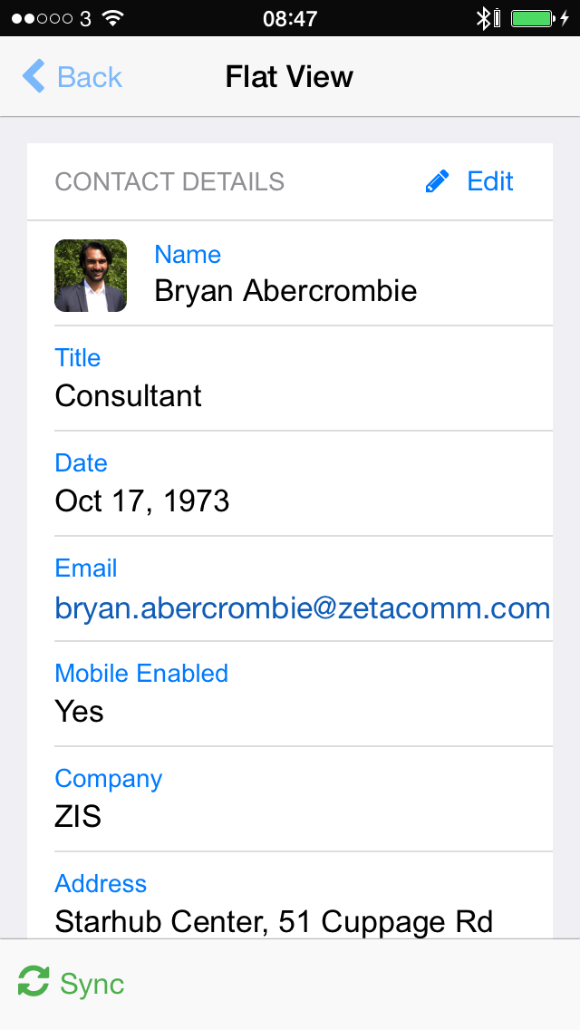
Form Viewer
A wrapper to allow you to display document data inside a card
You can also choose to display an Edit button.

- dbname
- the name of the database that contains the document, leave blank for the current database
From 1.4 To use a database on a different server use the format: myserver!!mydir/mydb.nsf (application server must be in trusted servers list on remote server, application server must be explicitly in ACL for remote database, and application server must be able to resolve remote server host name) - formname
- the name of the form for the document
- titlefield
- the name of the field from which to get the title (if this is set then the title property is ignored)
- titleiconfield
- the name of the field which contains a thumbnail to display in the title
- title
- An alternative static title
- showbuttons
- yes to display edit button and no to hide edit button
- editxpagename
- the xpage to use to edit the document with
- editxpagewithajax
- yes to edit the document with ajax or no to open the document in edit mode with a full page load
- newresponsexpagename
- the name of the xpage to open to compose a response
- footertext
- A static string to display in the footer of the card, leave blank if not required
- callback
- from v1.3 the name of a client side JavaScript function to call after clicking the edit document button (i.e. when a document is put into edit mode)
In the example below we see the markup required for the FirstName field. Note that it's being displayed using an H4 tag with the class list-group-item-heading applied to it.
          <?xml version="1.0" encoding="UTF-8"?>
          <xp:view xmlns:xp="http://www.ibm.com/xsp/core" xmlns:unp="http://unplugged.teamstudio.com"
          xmlns:xc="http://www.ibm.com/xsp/custom">

          <unp:UnpBootFormViewer editxpagename="PersonEdit.xsp"
          editxpagewithajax="yes" formname="Person" showbuttons="yes" title="Contact Details"
          titleiconfield="thumbnail" footertext="Built with Bootcards - Base Card">
          <xp:this.rendered><![CDATA[#{javascript:context.getUrlParameter("documentId") != ""}]]></xp:this.rendered>
          <xp:this.facets>
          <xp:panel id="list-group" xp:key="facet_1" styleClass="panel">
          <div class="list-group">
          <div class="list-group-item">
            <label>Name</label>
            <xp:text id="fullname" tagName="h4" styleClass="list-group-item-heading">
              <xp:this.value><![CDATA[#{javascript:docview.getItemValueString("FirstName") + " " + docview.getItemValueString("LastName")}]]></xp:this.value>
            </xp:text>
          </div>
          </div>
          </xp:panel>
          </xp:this.facets>
          </unp:UnpBootFormViewer>

          </xp:view>
As of version 1.2, custom buttons can be added to your form by populating the Editable Area "viewerbuttons". The only caveat to remember is that if you're using server side actions on your custom buttons that the page will need to be loaded with a full refresh, not an Ajax request.
          <xp:panel xp:key="viewerbuttons">
          <xp:link id="custombutton" value="#" styleClass="btn btn-danger pull-right"
          rendered="#{javascript:compositeData.showbuttons == true}">
          <i class="fa fa-folder"></i>
           Custom
          <xp:eventHandler event="onclick" submit="true"
            refreshMode="complete">
            <xp:this.action><![CDATA[#{javascript:print("Hello World");}]]></xp:this.action>
          </xp:eventHandler>
          </xp:link>
          </xp:panel>
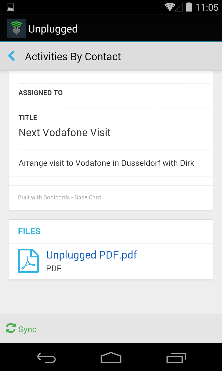
Image Viewer
A simple way to display an image to the user
The image will be displayed inside a card with a link below to download the image


- imageurl
- the URL for the image
- imagetitle
- the title for the image
          <xp:repeat var="imagefile">
          <xc:this.rendered><![CDATA[#{javascript:viewScope.images != null && viewScope.images.length > 0;}]]></xc:this.rendered>
          <xp:this.value><![CDATA[#{javascript:if (viewScope.images != null){
          var out = [];
          for (var i=0; i<viewScope.images.length; i++){
          var filetype = viewScope.images[i].filename.toLowerCase().split('.');
          filetype = filetype[filetype.length - 1];
          if (filetype == 'png' || filetype == 'gif' || filetype == 'jpg'){
          out.push(viewScope.images[i]);
          }
          }
          return out;
          }else{
          return null;
          }}]]></xp:this.value>
          <unp:UnpBootImageViewer imageurl="#{javascript:imagefile.url}" imagetitle="#{javascript:imagefile.filename}">
          </unp:UnpBootImageViewer>
          </xp:repeat>
Photo Upload
To upload pictures on your mobile device and also resize, rotate as required before uploading.
To upload an image, add this control.
It should be noted that if you are using Unplugged on Android that this control will not work correctly. In this situation you should use a basic file upload control as demonstrated in the Sampler application "BasicPhotoUpload".
- targetWidth: the width to resize the immage to
- targetHeight: the height to resize the image to
- targetDoc: the document binding to attach the file to
- itemName: the field to insert the image to
- showRotationControls: whether to allow the user to rotate the image before it's uploaded
- placeHolderIcon: the font-awesome icon to display before the image is uploaded
- crop: whether to crop the image rather than resize it when uploading
- customSelectElement: a classname to identify where to move the default photo upload button to (optional)
<div class="panel-body">
   Tap 'Select' to take a new photo or select from your Photos library, then tap 'Upload'.
   <div style="margin-top:15px; text-align: center;">
      <!-- show selected image -->
      <unp:UnpBootPhotoUpload
         targetWidth="1024"
         targetHeight="768"
         targetDoc="#{docPhoto}"
         itemName="photo"
         showRotationControls="false"
         placeHolderIcon="fa-camera"
         crop="false"
         customSelectElement=".js-custom-photo-select">
      </unp:UnpBootPhotoUpload>
   </div>
</div>
<div class="panel-footer">
   <xp:div styleClass="btn-group btn-group-justified">
      <div class="btn-group">
         <div class="js-custom-photo-select photoUpload btn btn-default">
            <i class="fa fa-camera"></i>
            Select
         </div>
      </div>
      <div class="btn-group">
         <button
            type="button"
            class="btn btn-default"
            onclick="unp.photoUploader.rotateImage(true)">
         <i class="fa fa-rotate-right"></i>
         Rotate
         </button>
      </div>
      <div class="btn-group">
         <xp:button
            value="save"
            styleClass="hidden"
            id="button1">
            <xp:eventHandler
               event="onclick"
               submit="true"
               refreshMode="complete"
               immediate="false"
               save="false">
               <xp:this.action>
                  <xp:saveDocument var="docPhoto"></xp:saveDocument>
               </xp:this.action>
            </xp:eventHandler>
         </xp:button>
         <xp:text escape="false">
            <xp:this.value>
               <![CDATA[#{javascript:"<button type=\"button\" onClick=\"unp.photoUploader.savePhoto(this, \'" + getClientId("button1") + "\')\" class=\"btn btn-default uploadphotobutton\">" +
                  "<i class=\"fa fa-upload\"></i>Upload</button>"}]]>
            </xp:this.value>
         </xp:text>
      </div>
   </xp:div>
</div>
<!-- panel footer -->
Typography Edit
An implementation of a Rich Text Editor
Used in conjunction with the Form Editor control, you can make use of the Quill rich text editor which will save HTML formatted text into the document.

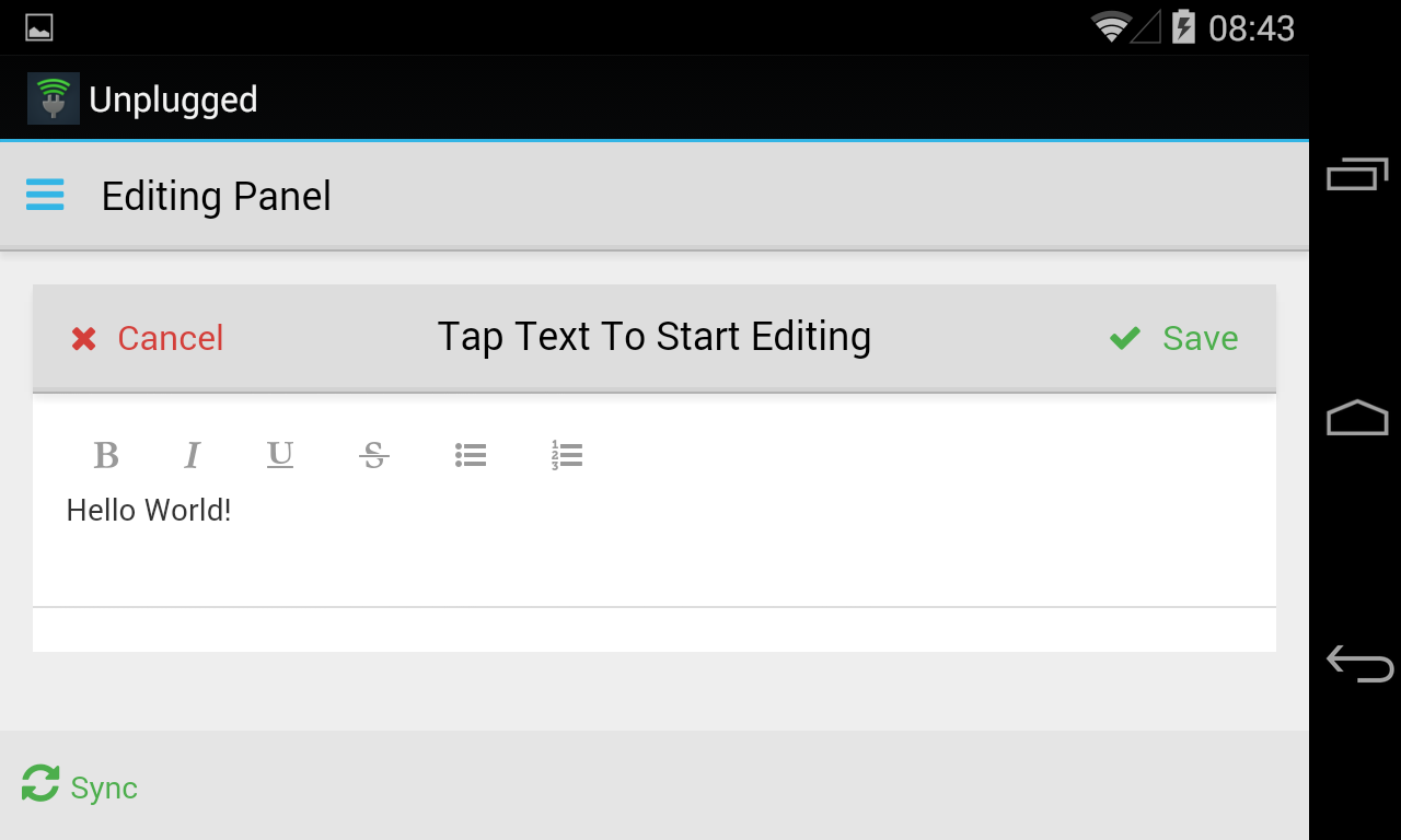

- fieldname
- the name of the field to get get the initial content from. The data must be HTML formatted or plain text. Domino Rich Text will not work.
<?xml version="1.0" encoding="UTF-8"?>
<xp:view xmlns:xp="http://www.ibm.com/xsp/core" xmlns:xc="http://www.ibm.com/xsp/custom"
  xmlns:unp="http://unplugged.teamstudio.com">
  <unp:UnpBootFormEditor showbuttons="yes"
    viewxpagename="FlatView.xsp" formname="Person" title="Person"
    xp:key="facet_1">
    <xp:this.facets>
      <xp:panel id="list-group" xp:key="facet_1">
        <div class="form-group">
          <xp:label value="Details" id="biolabel" for="bio"
            styleClass="col-xs-4 control-label">
          </xp:label>
          <div class="col-xs-8">
            <unp:UnpBootTypographyEdit fieldname="bio">
            </unp:UnpBootTypographyEdit>
          </div>
        </div>
      </xp:panel>
    </xp:this.facets>
  </unp:UnpBootFormEditor>
</xp:view>
Typography Read
A wrapper for text content that includes resize buttons
Ideal for use with large blocks of text to make them easier to read.


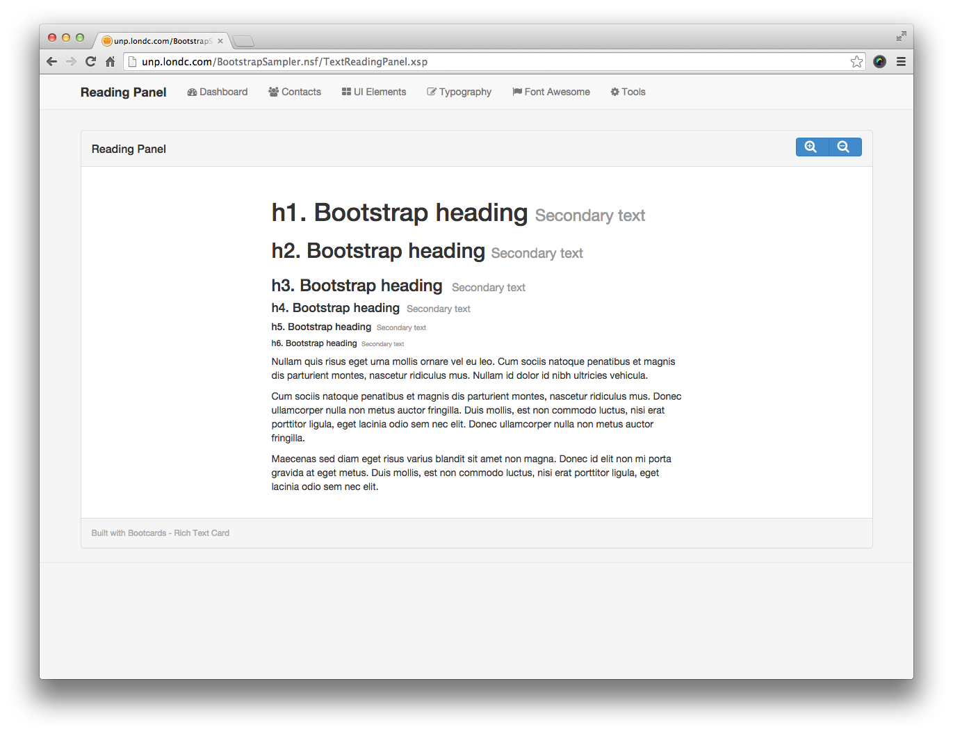
- title
- the title for the card
- footertext
- the footer text for the card
<?xml version="1.0" encoding="UTF-8"?>
<xp:view xmlns:xp="http://www.ibm.com/xsp/core" xmlns:xc="http://www.ibm.com/xsp/custom"
xmlns:unp="http://unplugged.teamstudio.com">
<xc:commonheader pagetitle="Reading Panel"></xc:commonheader>
<div id="main" class="container">
<div class="row">
<div class="bootcards-cards fullheightrow">
<div class="col-xs-12 col-sm-12 col-md-12">
<unp:UnpBootTypographyRead title="Reading Panel"
footertext="Built with Bootcards - Rich Text Card">
<xp:this.facets>
<xp:panel xp:key="typographyfacet">
<h1>
h1. Bootstrap heading 
<small>Secondary text</small>
</h1>
</xp:panel>
</xp:this.facets>
</unp:UnpBootTypographyRead>
</div>
</div>
</div>
</div>
<xc:commonfooter></xc:commonfooter>
</xp:view>
Other Controls
Alert
A simple way to display a modal message to the user
To display a simple message to the user, this is the easiest control to use.


- title
- The title for the modal window
- content
- The message to display
- dialogid
- The unique id for the modal
To launch the modal, in JavaScript use the unp.openDialog() function and pass in the dialogid to open
<?xml version="1.0" encoding="UTF-8"?>
<xp:view xmlns:xp="http://www.ibm.com/xsp/core" xmlns:xc="http://www.ibm.com/xsp/custom"
  xmlns:unp="http://unplugged.teamstudio.com">
  <xc:commonheader pagetitle="Dialog"></xc:commonheader>
  <div id="main" class="container">
    <div class="row">
      <div class="bootcards-cards fullheightrow">
        <div class="col-xs-12 col-sm-12 col-md-12">
          <div class="panel panel-default">
            <div class="panel-heading">
              <h3 class="panel-title">Dialog</h3>
            </div>
            <div class="panel-body">
              <p style="padding: 40px;">
                <input type="button" href='#' onclick="unp.openDialog('alertPopup')"
                  class="btn btn-primary" value="Open Alert">
                </input>
              </p>
            </div>
            <div class="panel-footer">
              <small class="pull-left">Built with Bootcards - Base Card</small>
            </div>
          </div>
        </div>
      </div>
    </div>
    <unp:UnpBootAlert content="This is an alert message"
      dialogid="alertPopup" title="Alert!">
    </unp:UnpBootAlert>
  </div>

  <xc:commonfooter></xc:commonfooter>
</xp:view>
Calendar
A basic calendar interface that allows you to display calendar items
Gets data from a view, and formats it to be displayed on a calendar. The calendar will detect the device being used and best format itself for optimal viewing.


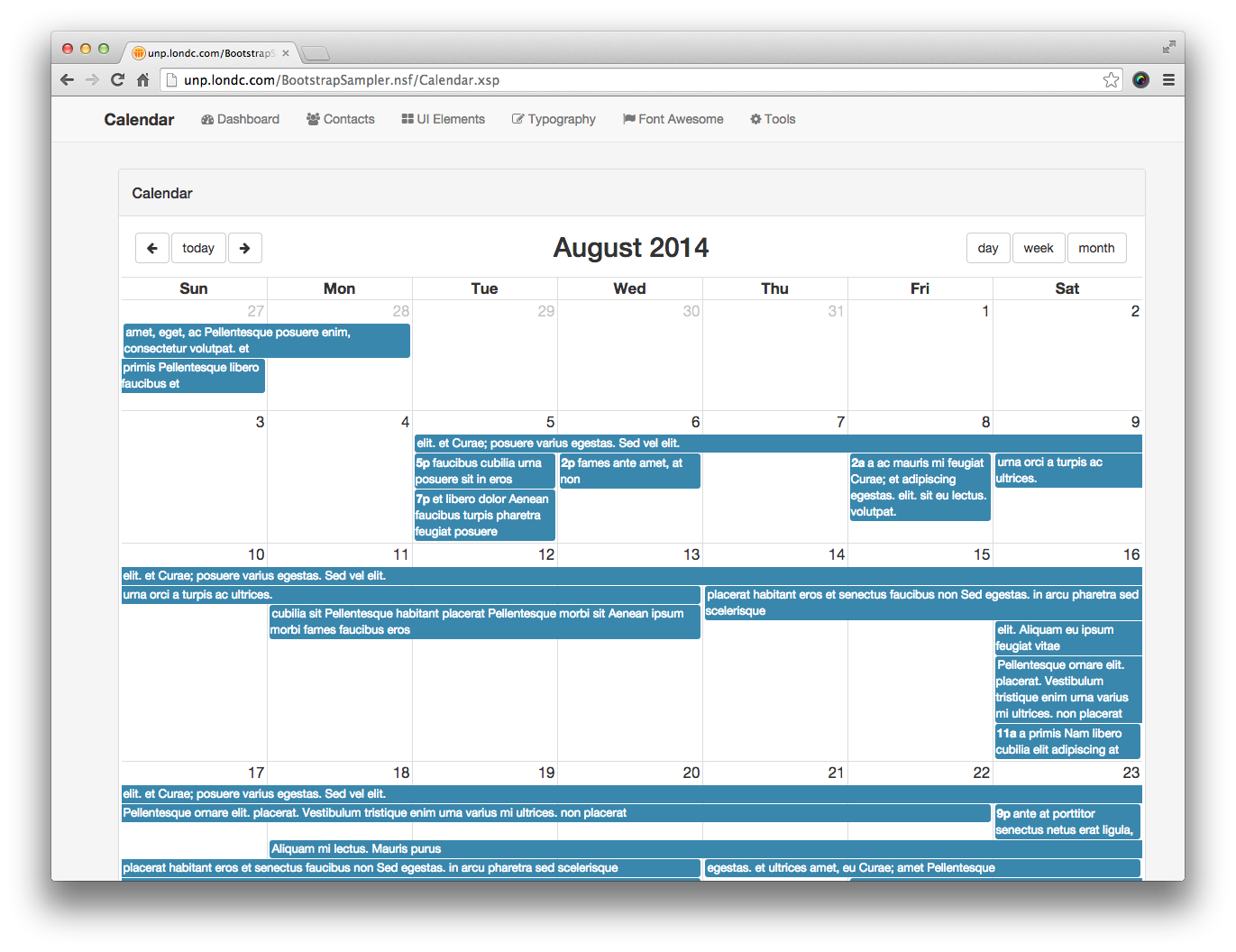
- title
- The title for the calendar
- viewname
- The view to get the data from. The view needs to be formatted in the same way as the example in the Sampler application.
- startdatefield
- The field to get the start date for each event from
- enddatefield
- The field to get the end date for each event from
- titlefield
- The field to get the title for each event from
- viewxpage
- The XPage to load when clicking on an event
- highlightfield
- The name of the field to check for highlighting, can be left blank
- highlighttest
- The logical test to see if the event should be highlighted, can be left blank
- headerbuttonsleft
- The list of buttons to display on the left header. Default is prev,today,next
- headerbuttonsrighttablet
- The buttons to display for a tablet. Default is agendaDay,agendaWeek,month
- headerbuttonsrightphone
- The buttons to display for a phone. Default is none
- defaultviewtablet
- The default view to open when viewed with a tablet, default is month
- defaultviewphone
- The default view to open when viewed with a phone, default is basicWeek
- filter
- A filter to apply to the view to get a subset of documents, can be left blank
- catfield
- The name of the field on event documents which will be used to create categories, can be left blank
- dbname
- The name of the database to load data from, can be left blank.
- footertext
- A footer string to display, can be left blank.
- callback
- from v1.3 the name of a client side JavaScript function to call after clicking on an entry (i.e. when a document is put into edit mode)
When using this control, don't forget to include the UnpCalendarData XPage
<?xml version="1.0" encoding="UTF-8"?>
<xp:view xmlns:xp="http://www.ibm.com/xsp/core" xmlns:xc="http://www.ibm.com/xsp/custom"
  xmlns:unp="http://unplugged.teamstudio.com">

  <xc:commonheader pagetitle="Calendar"></xc:commonheader>

  <div id="main" class="container">
    <unp:UnpBootCalendar enddatefield="EndDate"
      highlightfield="HighLight" catfield="Category" highlighttest="Yes"
      startdatefield="StartDate" titlefield="Title" viewname="CalendarEntries"
      viewxpage="CalendarEntry.xsp" headerbuttonsleft="prev,today,next"
      defaultviewtablet="month" defaultviewphone="basicWeek"
      headerbuttonsrighttablet="agendaDay,agendaWeek,month"
      headerbuttonsrightphone="" title="Calendar" footertext="Built with Bootcards - Base Card">
    </unp:UnpBootCalendar>
    <div class="pagetitle hidden">Calendar</div>
  </div>

  <xc:commonfooter></xc:commonfooter>
</xp:view>
Carousel
A simple way to show a series of images in a carousel
You just need to provide an array of image objects with URL.

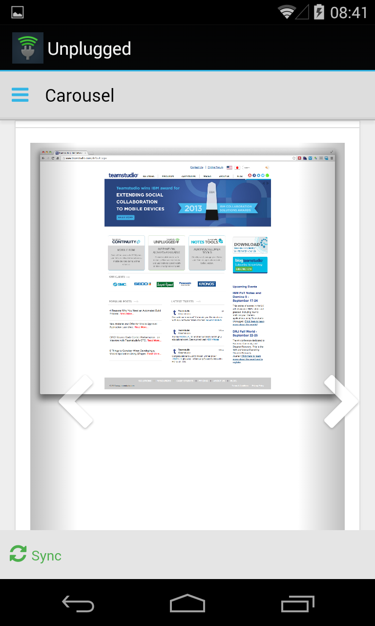

If you're using a Form Viewer control on the same page then the carousel will be automatically populated, if not then you'll need to populate viewScope.images in the following way.
As of version 1.2, you can optionally add three more properties to each image in the array: pageurl, title and description. If these are added then they will be displayed in a panel to the right of the image.
- footertext
- A static string to go in the footer. Can be left blank.
<?xml version="1.0" encoding="UTF-8"?>
<xp:view xmlns:xp="http://www.ibm.com/xsp/core"
  xmlns:xc="http://www.ibm.com/xsp/custom"
  xmlns:unp="http://unplugged.teamstudio.com">
  <xp:this.data>
    <xp:dominoDocument var="docview"
      formName="RefData"
      action="openDocument">
      <xp:this.documentId><![CDATA[#{javascript:var vw:NotesView = database.getView("Reference Data");
var docview:NotesDocument = vw.getDocumentByKey("SamplerSwipeView");
return docview.getUniversalID();}]]></xp:this.documentId>
    </xp:dominoDocument>
  </xp:this.data>
  <xp:this.beforePageLoad>
    <xp:executeScript>
      <xp:this.script><![CDATA[#{javascript:
viewScope.images = null;
var images = new Array;
var imageFile = "";
var attachmentList = null;
var docviewdoc = docview;
if (isUnpluggedServer()){
  attachmentList = docview.getItemValueString("value").split(",");
}else{
  attachmentList = $A(session.evaluate("@AttachmentNames", docview));
}
var thisUNID = docviewdoc.getUniversalID();
var dbPath = database.getFilePath();
dbPath = @ReplaceSubstring(dbPath, "\\", "/");
if (attachmentList != null && attachmentList.length > 0){
  for(var i=0; i<attachmentList.length; i++){

    var imagename = attachmentList[i];

    imageFile = "/" + dbPath + "/0/" + docviewdoc.getUniversalID() + "/$FILE/" + imagename;
    if (imagename != ""){
      images.push({
         url: imageFile,
         filename: imagename,
         pageurl: 'UnpMain.xsp',
         title: 'Caption Title',
         description: 'This is a block of text that will appear to the right of the image'
      });
    }
  }

  viewScope.put("images", images);
}}]]></xp:this.script>
    </xp:executeScript>
  </xp:this.beforePageLoad>
  <xp:this.resources>
    <xp:script src="/unpCommon.jss" clientSide="false"></xp:script>
  </xp:this.resources>
  <xc:commonheader pagetitle="Carousel"></xc:commonheader>
  <div id="main" class="container">
    <div class="row fullheightrow">
      <div class="col-sm-12">
        <unp:UnpBootCarousel
          footertext="Built with Bootcards - Media Card">
          <xc:this.carouselfileslist><![CDATA[#{javascript:viewScope.images}]]></xc:this.carouselfileslist>
        </unp:UnpBootCarousel>
      </div>
    </div>
    <div class="pagetitle hidden">Carousel</div>
  </div>
  <xc:commonfooter></xc:commonfooter>
</xp:view>
Charts
We make use of Morris Charts in our Sampler application
Although we don't provide a charting control in XControls, it's very simple to add charts to your application using any framework that is compatible with Bootstrap. In our Sampler application we use Morris Charts.
Dialog
A control that allows you to load a dialog box that can also use client side callbacks for application logic.


- callback
- The name of the JavaScript function to call when the user clicks the OK button.
- title
- The title for the dialog.
- footertext
- The footer text to display.
- dialogid
- The unique ID for the dialog.
- showok (v1.2)
- A boolean to allow your to show or hide the OK button (default is true)
- showcancel (v1.2)
- A boolean to allow your to show or hide the Cancel button (default is true)
- dismissonok (v1.2)
- A boolean that when false means clicking the OK button will not hide the dialog. You can do this in your callback function using unp.closeDialog('mydialog')
You can insert the content for the dialog by adding text or fields inside the editable area.
<?xml version="1.0" encoding="UTF-8"?>
<xp:view xmlns:xp="http://www.ibm.com/xsp/core" xmlns:xc="http://www.ibm.com/xsp/custom"
  xmlns:unp="http://unplugged.teamstudio.com">
  <xc:commonheader pagetitle="Dialog"></xc:commonheader>
  <div id="main" class="container">
    <div class="row">
      <div class="bootcards-cards fullheightrow">
        <div class="col-xs-12 col-sm-12 col-md-12">
          <div class="panel panel-default">
            <div class="panel-heading">
              <h3 class="panel-title">Dialog</h3>
            </div>
            <div class="panel-body">

              <p style="padding: 40px;">
                <input type="button" href='#' onclick="unp.openDialog('dialogPopup')"
                  class="btn btn-primary" value="Open Dialog">
                </input>
              </p>
            </div>
            <div class="panel-footer">
              <small class="pull-left">Built with Bootcards - Base Card</small>
            </div>
          </div>
        </div>
      </div>
    </div>
    <unp:UnpBootDialog callback="myCallBackFunction"
      title="Demo Dialog" dialogid="dialogPopup">
      <xp:this.facets>
        <xp:panel xp:key="facet_1">
          Lorem ipsum dolor sit amet, consectetur
          adipiscing elit. Donec vitae sapien mauris, non
          imperdiet purus.
          Pellentesque in metus nec
          sapien volutpat scelerisque ac vel
          turpis.
          Nunc
          sed nulla ac orci lobortis commodo ut eget
          justo.
          Curabitur
          tempor, risus vel congue
          dignissim, nisi libero tincidunt
          odio, id
          pharetra libero purus ut risus. Ut rutrum
          condimentum sem,
          at
          elementum nisi suscipit et.
          Maecenas semper, lacus et varius
          blandit,
          odio
          mauris sodales ligula, non congue leo neque nec
          magna.
          Etiam sed
          dolor in felis condimentum
          sodales eget a nisi.
          Nunc dui
          lectus,
          viverra
          non gravida eu, dictum ac neque.
          </xp:panel>
      </xp:this.facets>
    </unp:UnpBootDialog>
  </div>

  <xc:commonfooter></xc:commonfooter>
</xp:view>
Files
Given a list of files will display them formatted nicely as a list.
If you're using the form viewer then the list will be automatically populated, you just need to pass in viewScope.images to fileslist, if not then you'll need to build the list yourself.


- filestitle
- The title for the list
- fileslist
- An array of file objects that contain filename and url for each file. If you're using a FormViewer, then pass in viewScope.images
<xc:UnpBootFiles filestitle="Files">
  <xc:this.rendered><![CDATA[#{javascript:viewScope.images != null && viewScope.images.length > 0;}]]></xc:this.rendered>
  <xc:this.fileslist><![CDATA[#{javascript:if (viewScope.images != null){
  var out = [];
  for (var i=0; i<viewScope.images.length; i++){
    var filetype = viewScope.images[i].filename.toLowerCase().split('.');
    filetype = filetype[filetype.length - 1];
    if (filetype != 'png' && filetype != 'gif' && filetype != 'jpg'){
      out.push(viewScope.images[i]);
    }
  }
  return out;
}else{
  return null;
}}]]></xc:this.fileslist>
Login
A login control that will authenticate the user. Available from v1.3 onwards.
Create a Login XPage that uses the Login control, and then set the loginpage property on the UnpBootResources control, it will automatically redirect you to the Login page when you are not authenticated. Leave property blank if not required.
You must have enabled session authentication on your server and allow anonymous access to the page that is going to perform the authentication.
<?xml version="1.0" encoding="UTF-8"?>
<xp:view xmlns:xp="http://www.ibm.com/xsp/core" xmlns:xc="http://www.ibm.com/xsp/custom"
xmlns:unp="http://unplugged.openntf.org">

<xc:commonheader pagetitle="Sampler"></xc:commonheader>
<div id="main" class="container bootcards-container">
<div class="row">
<xp:div styleClass="bootcards-cards fullheightrow">
<unp:UnpBootLogin></unp:UnpBootLogin>
</xp:div>
</div>
</div>
<xc:commonfooter></xc:commonfooter>
</xp:view>
Workspace
Similar to the Notes workspace, this displays a list of icons
The icons come from a view, requiring a format similar to the Workspace used in the Sampler application


- title
- the title for the workspace card
- workspaceview
- the view from which to load the workspace icons
- labelcol
- The title of the column in the view that contains the labels for each icon
- iconcol
- The title of the column in the view that contains the Font Awesome icon name for each icon in the workspace
- linkurlcol
- The title of the column in the view that contains the link to open when the icon is clicked
- badgecol
- If there is a badge to display on the icon, the title for the column to get this data
- columndefinition
- To override the default column layout, enter the number of columns using Bootstrap formatting
- footertext
- Static text to display in the footer of the card
<?xml version="1.0" encoding="UTF-8"?>
<xp:view xmlns:xp="http://www.ibm.com/xsp/core" xmlns:xc="http://www.ibm.com/xsp/custom">
  <xc:commonheader></xc:commonheader>
  <div id="main" class="container">
    <div class="row">
      <div class="bootcards-cards fullheightrow">
        <div class="col-xs-12 col-sm-12 col-md-12">
          <xc:UnpBootWorkspace title="Workspace"
            linkurlcol="UnpUrl" labelcol="Title" iconcol="ImgUrl"
            badgecol="BadgeID" workspaceview="HomeLinks"
            footertext="Built with Bootcards - Summary Card">
          </xc:UnpBootWorkspace>
        </div>
      </div>
    </div>
  </div>
  <xc:commonfooter></xc:commonfooter>
</xp:view>
Utilities
Debug Toolbar
For developers, the debug toolbar can help with development in all environments
Just drop the control onto your XPage and you can log messages, view variables and more.

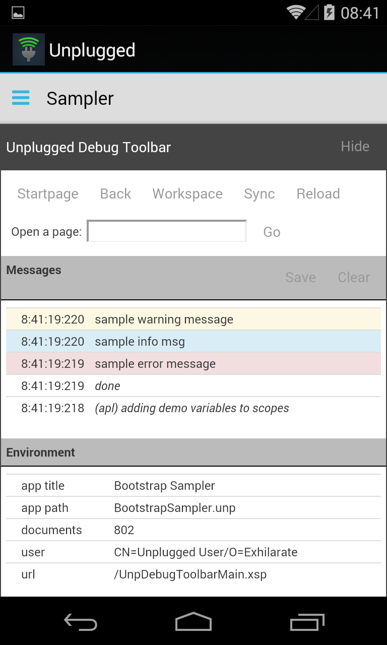

- defaultCollapsed
- true or false to define whether the toolbar should be collapsed when opening a page
<unp:UnpBootDebugToolbar defaultCollapsed="true"></unp:UnpBootDebugToolbar>
Header
The control to configuring the header bar
Used for the header bar navigation
- title
- title for the page
- navitems
- an array of objects that describe menu items. Each item should have the following properties: label, page and icon. The label is what will be displayed in the header bar, the page is the URL to open when the link is clicked and icon is the Font Awesome icon to use for the menu item.
- homeurl
- from v1.6 if you want the Brand logo (top left) to go somewhere other than UnpMain.xsp then enter the URL to open here
          <unp:UnpBootHeader>
          <unp:this.navitems><![CDATA[#{javascript:[
          {label: "Dashboard", hasSubMenu: false, page: "/UnpMain.xsp", icon: "fa-dashboard"},
          {label: "Lists", icon: "fa-list", children: [
          {"label": "Flat", "icon": "fa-list-alt", "page": "/FlatView.xsp"},
          {"label": "Detailed", "icon": "fa-list-alt", "page": "/DetailView.xsp"},
          {"label": "Categorized", "icon": "fa-list", "page": "/Categorized.xsp"},
          {"label": "Accordion", "icon": "fa-th-list", "page": "/Accordion.xsp"}
          ]},
          {label: "Cards", hasSubMenu: false, page: "/BaseCards.xsp", icon: "fa-book"},
          {label: "Other Controls", icon: "fa-th-large", children: [
          {"label": "Calendar", "icon": "fa-calendar", "page": "/Calendar.xsp"},
          {"label": "Carousel", "icon": "fa-files-o", "page": "/Media.xsp"},
          {"label": "Dialogs", "icon": "fa-comment", "page": "/Dialog.xsp"}
          ]},
          {label: "Tools", icon: "fa-cog", children: [
          {"label": "Debug Toolbar", "icon": "fa-bug", "page": "/DebugToolbar.xsp"},
          {"label": "XMark 1", "icon": "fa-bolt", "page": "/UPMark.xsp"}
          ]},
          {label: "New Person", newDocXPage: "PersonEdit.xsp", icon: "fa-new"}
          ]}]]></unp:this.navitems>
          <unp:this.title><![CDATA[#{javascript:if (isEmpty(compositeData.pagetitle)){
          return "Sampler";
          }else{
          return compositeData.pagetitle;
          }}]]></unp:this.title>
          </unp:UnpBootHeader>
Resources
This control will load all of the required CSS and JavaScript files onto a page when it loads. It should be included in all XPages in your application.
- loginpage: from v1.3 you can specify a login page to redirect to if the current user is anonymous. You must create the login page as required. Leave blank to use standard Domino authentication.